
AI slop: why every AI-built site looks the same
Why AI-generated interfaces converge on the same purple gradient and card grid, twelve tells to spot it, and a workflow that turns “make it look better” into checks you can actually run.


On this page
Open five landing pages built with an AI coding agent this year. Count how many have a dark hero with a purple-to-violet gradient bleeding out of one corner. Count the headlines that say some version of "I build things" or "Build the future." Count the rows of equal-width cards with the same sixteen-pixel radius.
I know the pattern well, because my own portfolio was one of them.
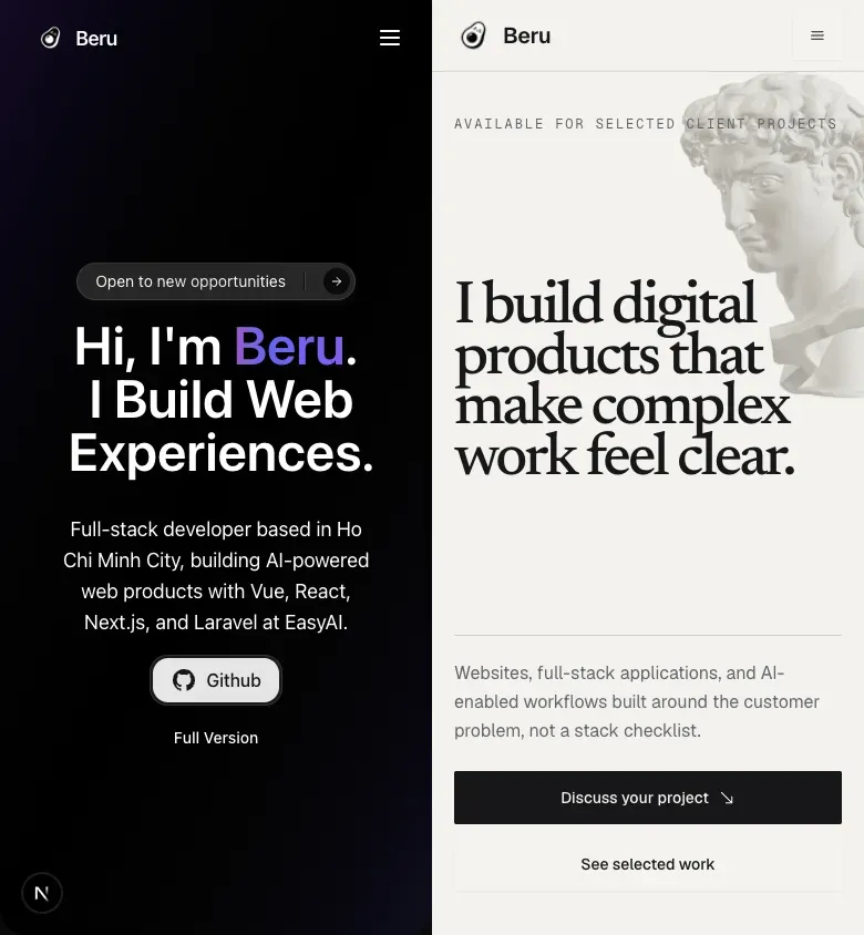
Here is the homepage of this site earlier this year:

Dark background. Purple gradient wash behind the hero. My name in violet. A headline that read "Hi, I'm Beru. I Build Web Experiences" — a sentence that would sit just as comfortably on a thousand other developer portfolios. Four empty cards of identical width. A pill-shaped badge. A pill-shaped button. Acres of dark space carrying no information.
Every individual decision there is defensible. Together they said nothing about me, my work, or why anyone should hire me.
This is about why that convergence happens, how to recognise it, and — the part almost nobody writes about — how to replace "make it look better" with criteria you can actually check.
What AI slop is
AI slop is low-effort output generated by AI and shipped with little or no human editing. In interface work it shows up as a page that is competently built and completely interchangeable: the visual language communicates nothing about the product, the brand, or the people behind it.
The term is worth being precise about. AI slop is not "design made with AI." Plenty of good work involves AI. Slop is specifically the unedited case, where the model's most probable output shipped without anyone asking whether it fit.
The giveaway is not ugliness. Slop usually looks fine. It looks fine the way a stock photo looks fine.
Why AI keeps producing the same interface
This is not a taste problem. It is a mechanical consequence of how the models work.
A language model generates by predicting the most probable next token given everything before it. Run that process over a request like "build me a modern landing page hero" and it reaches for the patterns most heavily represented in its training data — which is to say, the most common patterns on the internet.
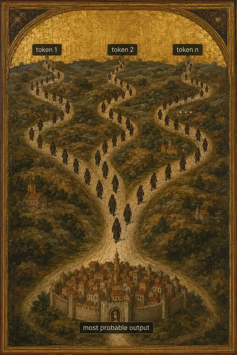
The most common patterns on the internet are:
- Inter, or the system font stack
- A blue-to-purple gradient
- An oversized hero with a vague, aspirational headline
- Card-based layouts, uniform radius, uniform shadow
- Generous padding everywhere, hierarchy nowhere
Designers call the result distributional convergence. Ask three different agents, in three different sessions, for a SaaS landing page, and you get siblings. Not because any of them copied the others, but because they all walked toward the same statistical centre.
Understanding this matters, because it tells you where the fix has to live. You cannot prompt your way out of an average by asking for "something more premium" — that phrase is itself an average. The fix is to supply constraints specific enough that the probable answer stops being available.
What agents actually get right
It would be easy to read the above as an argument against using AI for interface work. It is not, and pretending otherwise would be dishonest about my own process — every page discussed here was built with an agent.
Agents are genuinely good at the things humans skip when bored:
- State coverage. Ask for a form and you will get loading, error, disabled, and success states without being reminded. Most hand-built forms ship with one of the four.
- Accessibility scaffolding. Label associations,
ariaattributes, focus rings, and keyboard handlers arrive by default. Not always correct, but present, which is more than a lot of production code manages. - Mechanical consistency. Once a token exists, an agent applies it everywhere without drifting, which is exactly the discipline humans lose around hour four.
- Volume. Twelve variants of a component in the time it takes to hand-build one.
What they are bad at is choosing. An agent will happily generate twelve variants and has no basis for preferring one, so it returns the most typical. Every part of the workflow below exists to supply that missing judgement — not to replace the generation, just to constrain it.
The failure is not that the model produced a purple gradient. It is that nobody told it not to, and nobody checked.
Twelve tells
Run this against any page. Each one on its own can be a legitimate choice. Three or more together, and you are looking at slop.
- A purple or blue-violet gradient behind the hero, doing no informational work.
- Glass cards — translucent panels with a blur, used regardless of whether anything is layered underneath.
- A grid of equal-width cards where the content inside them varies wildly in importance.
- Pill everything. Pill badges, pill buttons, pill tags, all at maximum radius.
- Arbitrary blobs and gradient orbs floating in the background.
- Decorative terminal chrome — a fake window with three dots, wrapping content that is not a terminal.
- A custom cursor that replaces the system cursor and makes targets harder to hit.
- Motion without a job. Things fade and rise on scroll because the library was installed, not because the movement means anything.
- A vague headline. "Build the future." "Ship faster." "I build web experiences."
- One radius everywhere. The same corner on the button, the card, the input, the image, and the modal.
- The same layout family repeated across consecutive sections — three cards, then three cards, then three cards.
- Everything wrapped in a card, because a card is a safe way to avoid making a hierarchy decision.
Count them on my old homepage. I get seven.

The part that matters more than aesthetics
Everything above is a style problem, and style problems are survivable. The dangerous version of slop is different, and it is about evidence.
When an agent fills a testimonial section, it produces testimonials. When it fills a logo wall, it produces logos. When a case study needs a result, it produces "increased conversion by 40%." None of it arrives marked as invented, because the model has no concept of the difference between a plausible sentence and a true one.
Ship that and you have published fabricated claims under your own name.
The defence is to make evidence status explicit. In my workflow every finding carries one of five labels:
| Label | Meaning |
|---|---|
| Observed | Verified in the rendered UI or at runtime |
| Code-derived | Supported by inspected code, not by running it |
| Corroborated | Supported by more than one independent source |
| Hypothesis | Plausible, unverified |
| Unknown | Missing evidence, or an unresolved decision |
The rule that follows: never promote a label. A hypothesis that survives a rewrite is still a hypothesis. Code-derived is not Observed. If a number cannot be labelled Observed or Corroborated, it does not go on the page. Omit it, or mark it, but never replace it with polished filler.
This one discipline removes the worst failure mode, which is not an ugly page. It is a confident page that lies.
Start with a Design Read, not a mood
Before any code, write four lines.
- Audience — who is this for, concretely?
- Job to be done — what is that person trying to accomplish?
- Visual direction — in words that constrain, not words that flatter.
- Foundation — what stack, tokens, and components already exist?
Mine, for the rebuild:
Audience: technical hiring managers and founders evaluating whether I can own a product surface end to end. Job: judge the quality of the work in under sixty seconds without reading. Direction: editorial print, paper over ink, real screenshots as the hero material, no decorative gradient. Foundation: Next.js App Router, Tailwind, existing primitives, and the
/ui-labcatalog.
Notice that "editorial print, paper over ink" is a constraint. It rules things out. "Modern and clean" rules nothing out, which is exactly why an agent hands you the statistical average when you say it.
Writing the constraint into the prompt
A Design Read only helps if it reaches the model. In practice that means replacing adjectives with prohibitions and references.
Compare these two instructions for the same task.
Build a modern, clean hero section for a developer portfolio. Make it look premium.
Every word there describes a centre of mass. "Modern" in 2026 training data is the gradient. "Clean" is generous padding and a card. "Premium" is a dark background with a subtle glow. The model is not misreading you; it is giving you precisely what those words mean statistically.
Now the same request with constraints:
Hero for a developer portfolio. Background is warm off-white, ink-on-paper contrast, no gradient anywhere. Headline is a full sentence making a specific claim, maximum two lines at 1440px, set in a display serif. Directly beneath it, one real product screenshot at 16:10, not a mockup frame. No cards, no badges, no pills. Body copy no wider than 62 characters. The only interactive element above the fold is a single text link.
The second version rules out most of the probability mass. It names materials, sets numeric limits, and forbids the specific patterns that would otherwise arrive by default. It is also much harder to write, which is the actual work — the thinking that "make it premium" was avoiding.
A useful test: read your prompt back and ask which sentence would stop the model from producing the most obvious version. If no sentence does that, you have written a mood, not a brief.
Use references as evidence, not as templates
Most people either ignore references or clone them. Both are wrong. The useful move is to treat a reference the way you would treat a source in research: extract what transfers, reject what belongs to someone else.
Sort every observation into three buckets.
Borrow — transferable visual grammar. Type contrast. Grid proportion. How images are cropped. What collapses first on mobile.
Adapt — patterns that need a product-specific substitute. A reference's pricing table becomes your case-study proof panel: same structural role, different content.
Reject — always. Source code. Proprietary assets. Brand marks. Distinctive identity. Copy. Inaccessible behaviour. Decorative systems that serve their product and not yours.
A reference tells you what worked for a different product. It never tells you what to build. That translation is the job, and it is the step agents skip by default.
Turn "better" into something you can check
This is the part I have not seen written down anywhere, and it does the most work.
"Cleaner," "more premium," and "more modern" cannot be verified. Two people will disagree, an agent will optimise toward the average, and nobody can tell when the work is done. So convert every aesthetic goal into an observable criterion before implementation starts.
| Vague goal | Observable criterion |
|---|---|
| Stronger hero | Headline occupies no more than two lines at 1440px |
| Better mobile | document.documentElement.scrollWidth equals viewport width at 390px |
| Cleaner navigation | Navigation stays on one line and does not collide at 1440px |
| More usable menu | Menu trigger is at least 44px and returns focus on close |
| Better imagery | Project imagery uses the real asset and is never stretched |
| Clearer priority | On mobile the order is copy, then CTA, then media |
| Respects preferences | With reduced motion on, all content is present and nothing stays hidden |
| Less generated-feeling | No layout family repeats across consecutive sections |
That last row is the interesting one. "Feels generated" sounds subjective until you name the mechanism — repetition of layout family — and then it is just a thing you look at and count.
Write these rows before you build. They become the review checklist, and they end the argument about whether the work is finished.
One row, worked through
Take the mobile row: document.documentElement.scrollWidth equals viewport width at 390px.
On the first pass of my rebuild it did not. The value came back 412 against a 390 viewport — twenty-two pixels of horizontal overflow, which on a phone shows up as a page that drifts sideways when you scroll.
Nothing in a screenshot reveals this. A full-page capture renders at whatever width you request and looks perfect. A code review does not reveal it either, because no single line is wrong. The cause was a project card with a fixed minimum width that had been fine at every breakpoint I had thought to check, and was twenty-two pixels too wide at exactly this one.
The criterion caught it because it is a number that either matches or does not. "Better mobile" would never have caught it — I would have looked at the screenshot, decided it looked better, and shipped the overflow.
This is the whole argument for the table in miniature. The value is not that these criteria are clever. It is that they are falsifiable, and a falsifiable criterion occasionally tells you that you are wrong. An aesthetic judgement never does.
Ship one vertical slice first
The common failure is redesigning every section in parallel, then discovering at the end that the type scale does not survive long headings and the card component cannot hold a real screenshot.
Instead, build the smallest slice that exercises the whole system:
- scoped semantic tokens and typography
- navigation, including the mobile open state
- the hero
- one real content block, with real content — not lorem, not a placeholder image
- the matching specimens in your component catalog
Then stop and review it against the criteria table. If the visual language fails, it fails once, in one place, cheaply. Fix the tokens and the shared anatomy before that failure gets copied across twelve sections.
The "one real content block" rule earns its place repeatedly. Real content has awkward lengths, missing fields, and images with the wrong aspect ratio. Placeholder content is uniformly cooperative, which is precisely why a design that works with it often collapses on contact with production.
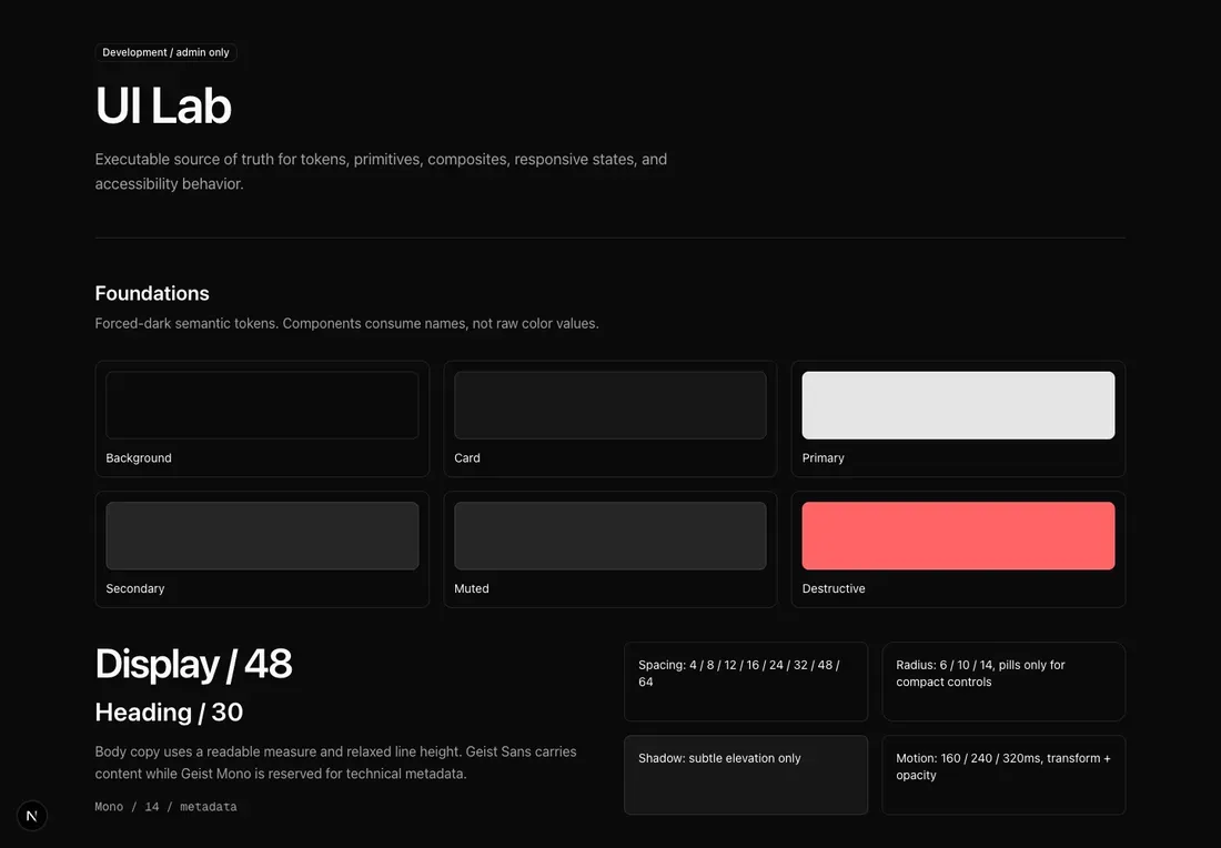
That catalog is not decoration. It is a rendered contract. When a reusable visual behaviour changes, the specimen changes in the same commit — otherwise the catalog drifts into fiction and stops being useful as a reference.
What "done" actually means
A build that compiles is not proof that an interface works. Neither is a full-page screenshot, which can leave in-view content unrevealed and hides every interactive state.
Verify in proportion to scope, and report results in four separate groups.
Passed — criteria directly verified.
Failed — criteria that miss the contract, with the surface and the evidence.
Unknown — criteria you could not prove, plus what would prove them.
Intentionally skipped — out of scope, or needing access you do not have.
The discipline is in keeping Unknown separate. The temptation is always to fold it into Passed, because Unknown looks like incomplete work. It is not incomplete work. It is accurate reporting, and it is the difference between a review you can trust and one you cannot.
Two rules I hold to strictly. Never describe local or mocked evidence as production proof. Never let build success stand in for visual verification.

The result
Here is the same homepage after the process:
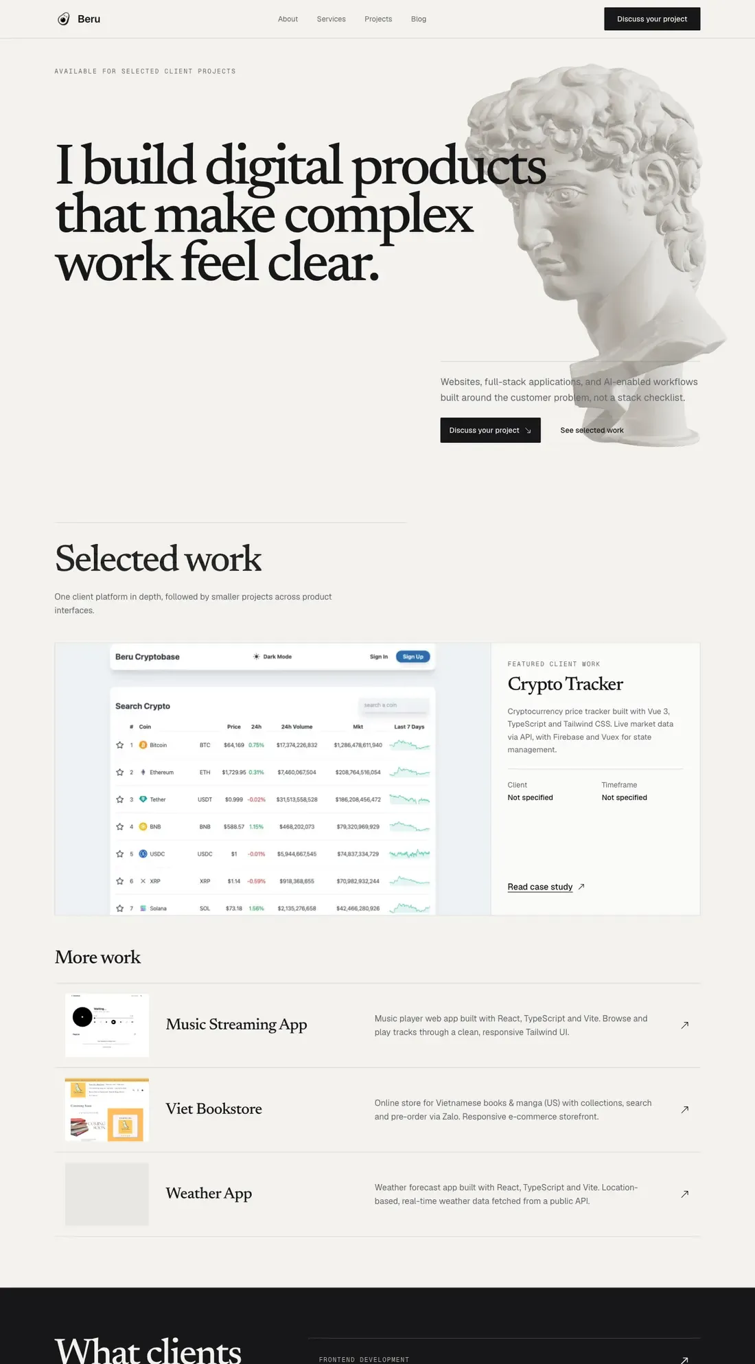
The gradient is gone. The empty cards are gone, replaced by real screenshots of real products I worked on. The headline is "I build digital products that make complex work feel clear" — still a claim, but a specific one that the page then has to support. Layout families vary between sections. The dominant material is the work itself.
One measurement I did not expect. The old homepage rendered 10,751 pixels tall at 1440px. The current one renders 6,470 — forty percent shorter, while carrying considerably more actual information.
That gap is what slop costs in practice. The old page was not tall because it had a lot to say. It was tall because empty cards, oversized padding, and repeated section rhythm consume vertical space without adding content. A visitor had to scroll through roughly twice as much page to learn less.
It is not a more fashionable page. It is a page that could only belong to me, which is the only property that matters and the exact property slop lacks.
When generic is the right answer
One caveat, because the argument above can be taken too far.
Distinctive visual language is valuable on surfaces where being remembered matters — portfolios, marketing sites, landing pages, anything whose job is to make an impression on a first-time visitor.
It is actively harmful on surfaces where being predictable matters. An admin panel, an internal dashboard, a settings screen, a data table, a checkout flow. On those, users are trying to complete a task they have completed before, and every unfamiliar pattern is a tax. A conventional table that behaves exactly like every other table is the correct answer, and reaching for a distinctive one is a design failure dressed up as ambition.
The same instinct that produces slop on a marketing page — defaulting to the most common pattern — produces the right result on a settings page. The skill is knowing which surface you are on.
So the rule is not "never look conventional." It is: on surfaces that need to be memorable, the most probable output is a starting point and never a destination; on surfaces that need to be operable, the most probable output is usually correct and deviating from it needs a reason.
Applying marketing-page composition to an application UI is its own category of mistake, and agents do it constantly, because the training data is full of marketing pages.
Use the workflow
I packaged all of this as an agent skill. It runs in both Claude Code and Codex, it is MIT licensed, and it is here:
github.com/locflamedia/ui-revamp-workflow
It handles the audit, the reference decomposition, the contract, the acceptance matrix, and the rendered verification. It refuses to invent metrics or clone brand identity. When no browser is available it tells you which checks are Unknown instead of quietly claiming they passed.
Install it into ~/.claude/skills/ or ~/.codex/skills/ and point it at a page.
The one-line version
AI does not produce generic interfaces because it lacks taste. It produces them because "modern and clean" describes the average, and the average is exactly what a probability model returns.
Give it constraints specific enough that the average stops being an acceptable answer, then verify the result in a browser rather than in your head.
Written and tested by Nguyen Hoang Loc (Beru), Ho Chi Minh City